About the project:
In 2019 the numbers of the registration of Users went down, so the stakeholders of CasinoClub gave us the task to improve the registration funnel.
As a UI/UX Designer in this project I started with research using Google Analytics and HotJar and checked the registration funnel on our other Casino brands and on the competition, which lead to this conclusions:

Pain Points:
- Users get unclear or generic error messages, so they don’t know where the problem is
- Info or error messages cover the content
- Users get stuck and drop out therefore
Ideas & Solutions:
- Optimize/rewrite error messages, make them more clear, no generic ones
- Offer Chat function with Customer support when users get stuck
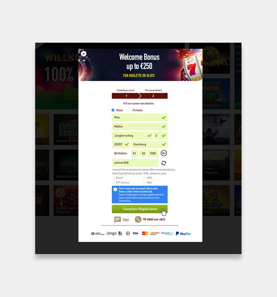
- Improve layout so correctly and incorrectly filled fields are better visible
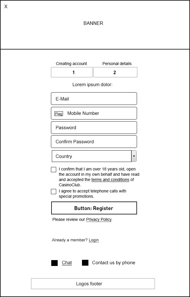
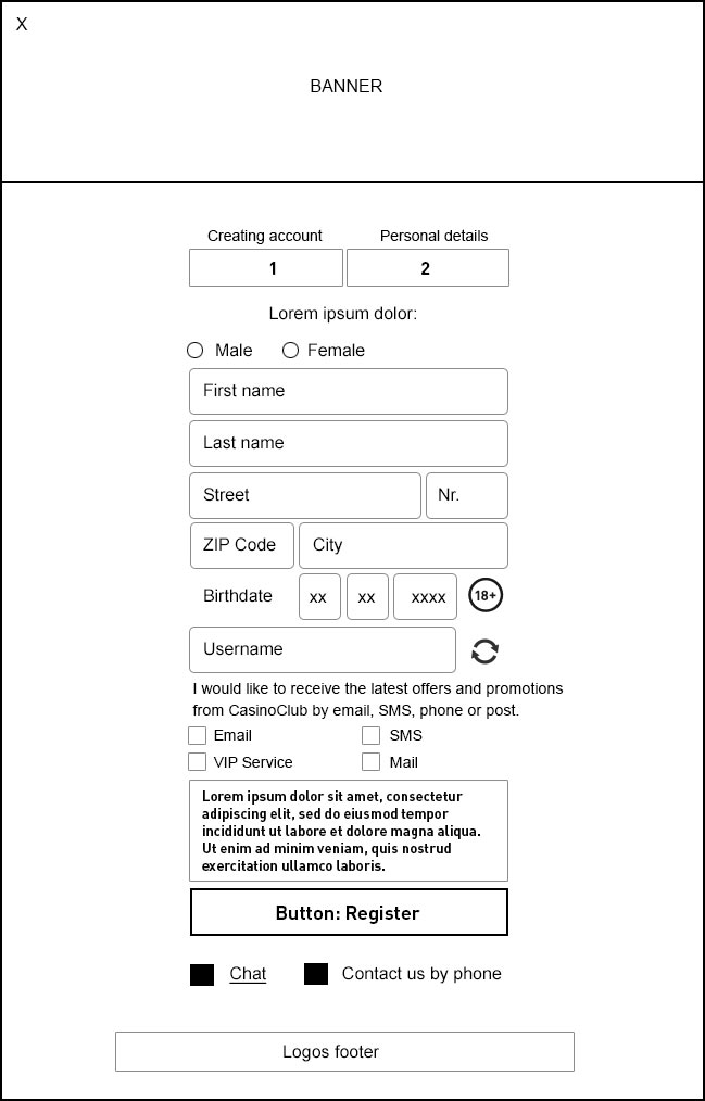
Wireframes:
Wireframe examples of the funnel:
Prototype:
Invision animation of pre-version of the funnel:
Open Prototype in new window.
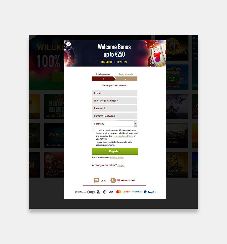
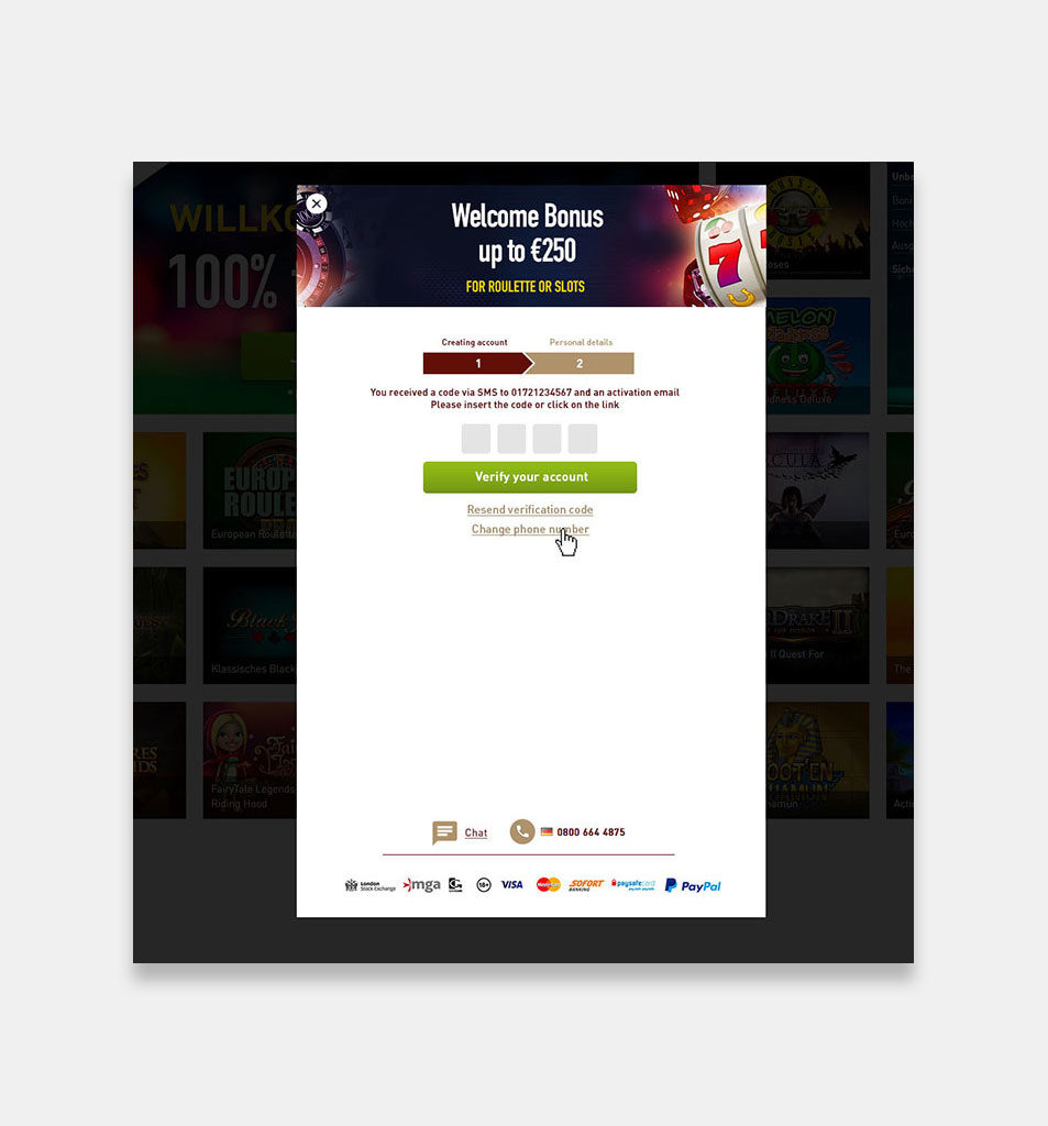
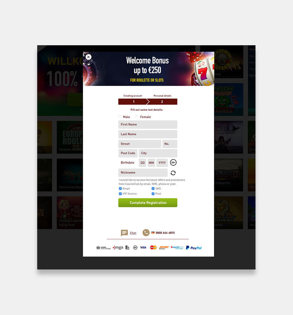
Design:
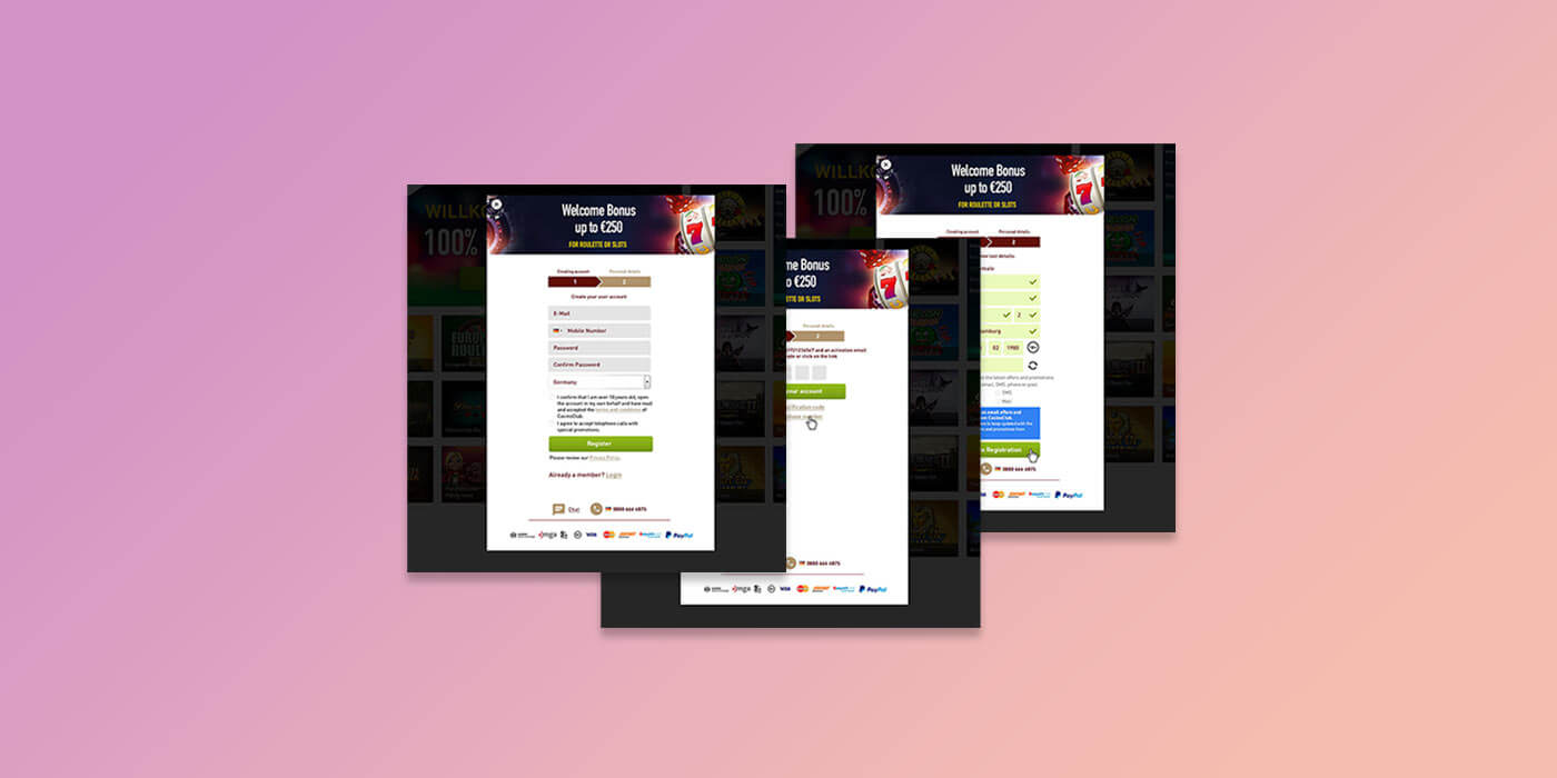
Designs of the final version of the funnel:
User-testing:
In the design phase we did A/B testing with the users and internal testing with colleagues to see if we are on the right path. We improved the visibility of the correctly or incorrectly filled fields after the testing with icons.


